

The most useful trend is not a colour or an effect. It is a shift in what audiences want to feel, recognise and remember. Here are four directions worth examining in 2026.
Adobe’s 2026 Creative Trends Forecast groups its observations around sensory experiences, human connection, surreal playfulness and local cultural expression. These are directional observations from a commercial creative report, not proof that every audience wants the same thing.
Use a forecast to ask better questions. Which part of the direction fits the brand’s purpose? What might your audience find meaningful? What would still work after the novelty fades? A trend earns its place when it helps communicate something specific, not simply because it makes a presentation feel current.
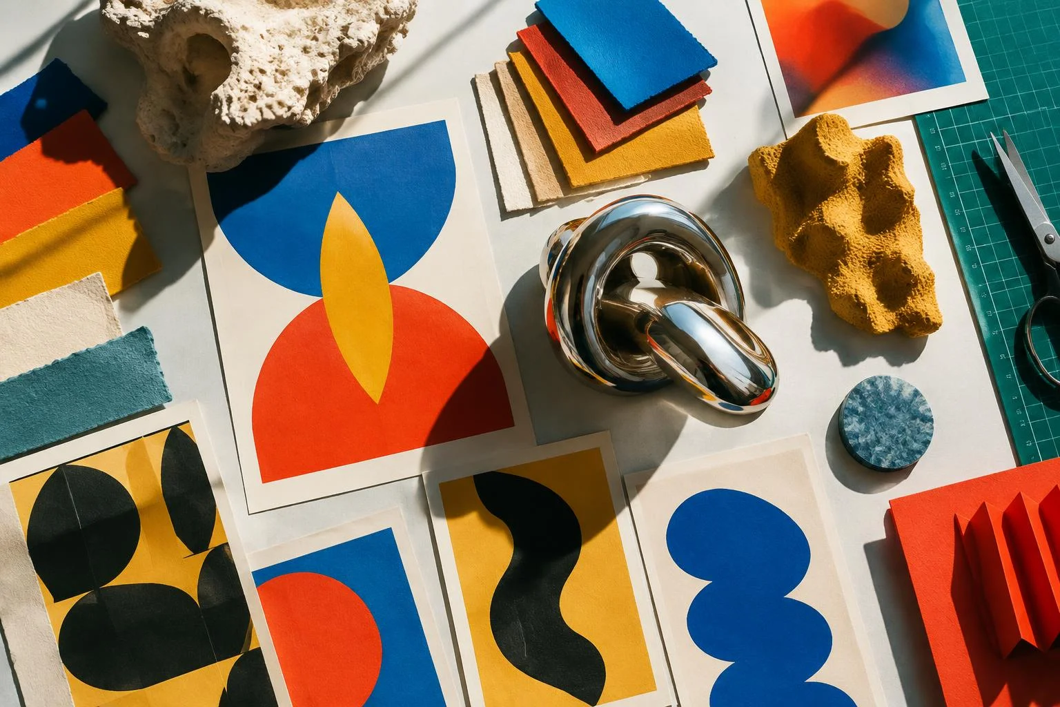
Texture, material and dimensionality can make visual work feel less detached from the physical world. A printed invitation, the movement of fabric in an event space or a well-chosen sound can extend the experience beyond a screen. Digital design can suggest those qualities without pretending it can literally reproduce every sense.
The practical test is restraint. Choose materials or motion that support the message. Keep text legible and consider the conditions in which people encounter it. A beautiful surface that makes information difficult to read is still a communication problem.
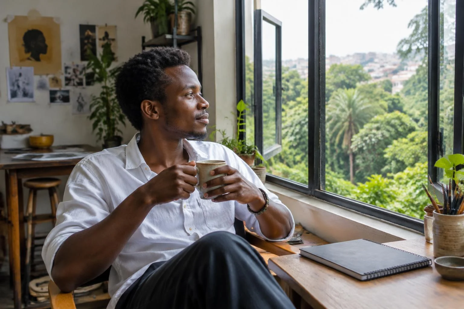
Work that acknowledges real relationships and everyday life can offer an alternative to interchangeable polished imagery. That might mean a more conversational voice, documentary photography with consent or a story grounded in the audience’s actual circumstances.
Authenticity is not a filter. Do not stage a supposedly spontaneous moment and present it as evidence. Give the people represented a voice in how their stories are used. If images are generated, be clear where their realism could create a misleading impression.
Surreal imagery and unexpected combinations can create curiosity, especially when a brand has room for experimentation. AI and other tools make it easier to explore unusual forms, but possibility does not remove the need for a coherent idea.
Anchor the experiment in a recognisable message. A strange image should invite people into the work, not leave them guessing what the organisation does. For a campaign, test how the idea behaves across a small phone screen, a poster and a short motion sequence before committing to it.
Language, neighbourhoods, music, craft and social habits can inform a direction more meaningfully than borrowed global aesthetics. For a creative working in Kampala, local context is not decorative seasoning; it can be a starting point for the concept.
Research carefully, avoid flattening cultures into motifs and collaborate with people who understand the references. Check permissions and attribution where relevant. Cultural specificity is strongest when it is lived and understood, not extracted to make a moodboard look distinctive.
- Name the audience need before selecting the visual trend.
- Build one test that shows the direction in a real application.
- Check readability, accessibility and performance.
- Ask whether the idea is recognisable without the fashionable effect.
The lasting skill is knowing what to leave out. Use trends to widen your thinking, then let the brief, the context and your judgment decide.
Adobe: 2026 Creative Trends Forecast